The third extra text box on the Ryuzine Press > Add New or post edit page is labeled “Issue Specific Styles.” If you want to style something specifically for the currently selected Ryuzine Press Edition this is where you do it.
In the box enter styles without <style>….</style> tags. Each element of the Ryuzine publication is already tagged with a unique ID and a general class. For example, the cover is always ID=0 and the parts can be references as follows:
#folio0 – this is the container that determines page width and height
#page0 – the actual page.
#shadow0 – the shadow (if enabled) under the page as it turns.
#header0 – the header on the page.
#live0 – the “live area” is between the header, footer, and left/right margins.
#column0 – the actual page content ends up in this container.
#footer0 – the page footer showing the publication title and page number
#margin-left0 – page turn button in the left margin (disabled for the cover)
#margin-right0 – page turn button in the right margin
Each of these elements is also part of a generic class similarly named:
.folio, .page, .shadow, .header, .footer, .live, .column, .footer,
.margin-left, .margin-right
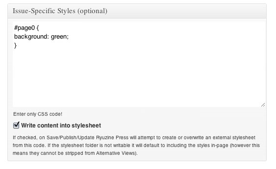
Let’s say you wanted the background of your cover to be green and didn’t want the headers or footers to show anywhere in the magazine, but you did want to keep their spacing. Here’s what you’d put in that “Issue-Specific Styles” box:
#page0{ background: green; }
.footer, .header { visibility: hidden; }
If you wanted to style the back cover without having to figure out what the id number for it is you can reference it by the “covercorners-back” class, which is always attached exclusively to the back cover. For example to set the back cover’s background:
.covercorners-back .page { background: lightblue; }
You probably also noticed the “Write Content Into Stylesheet” checkbox. If that box is checked AND the ~/wp-content/plugins/ryuzine-press/generated_css/ folder is writable, the Ryuzine Press plugin will attempt to create an external stylesheet using whatever styles are in the “Issue-Specific Styles” box when you save or update the Edition post.
Beta Testers: note that the location has moved from ~/wp-content/plugins/ryuzine-press/ryuzine/css to -/wp-content/plugins/ryuzine-press/generated_css/ so updates to the webapps do not require regenerating stylesheets, only updates to the plugin itself.
If the directory is not writable or you did not tick the checkbox an external stylesheet is not generated. In that case any styles in the “Issue-Specific Styles” box will be written directly into the Ryuzine webapp page. When viewing a Ryuzine Press Edition it will check for the existence of an external stylesheet. If it doesn’t find one it writes the styles into the page with the content. This means you can also create the external stylesheet for an edition yourself and upload it manually to the Ryuzine webapp “css” folder. Just name the file in the format of “issue_id.css” where “id” is the Ryuzine Press Edition’s ID number (which is shown on the Ryuzine Press > All Posts table).
Why external stylesheets? The Ryuzine webapp has alternative viewing modes, one of which is labeled “HTML Only” and is intended to strip out all issue-specific styles and deliver just raw text and images. When the styles are written directly into the page they cannot be stripped out. So, the only downside if you don’t have the external stylesheets is if your readers want to use the “HTML Only” alternative viewing mode (which some may need if they are using low-end mobile devices). If that’s not a huge concern to you, though, you can simply never check the “Write Content Into Stylesheet” box.
Note: If you accidentally move, rename, or delete issue-specific external stylesheets and your server is set up to allow auto-generating them there is a button in Ryuzine Press > Tools > Update Ryuzine “Regenerate Stylesheets” which will create/recreate the external stylesheets in a bulk process. This is an easy way to make sure every Edition with issue-specific styles has corresponding stylesheet, but if you have published a lot of Editions it can take a while to complete the operation.
One of the best uses of the issue-specific styles is to tile a pattern or color into the background of a specific page, or do a “full bleed” background image. Here is a sample stylesheet for something like that:
.page { background: tan url('https://www.myblog.com/blog/wp-content/uploads/2012/02/parchment.jpg'); }
#page0 { background: #ccc url('https://www.myblog.com/blog/wp-content/uploads/2012/02/covershot_medium.jpg') 0 0 no-repeat; }
/* Widescreen Monitor */
@media only screen and (min-width: 1600px) {
#page0 { background: #ccc url('https://www.myblog.com/blog/wp-content/uploads/2012/02/covershot_xlarge.jpg') 0 0 no-repeat; }
}
/* Desktop Screen 1280 to 1600 px */
@media only screen and (min-width: 1280px) and (max-width: 1599px) {
#page0 { background: #ccc url('https://www.myblog.com/blog/wp-content/uploads/2012/02/covershot_large.jpg') 0 0 no-repeat; }
}
/* iPad in Landscape */
@media only screen and (min-width: 1024px) and (max-width: 1279px) {
#page0 { background: #ccc url('https://www.myblog.com/blog/wp-content/uploads/2012/02/covershot_medium.jpg') 0 0 no-repeat; }
}
/* iPad + Android Tablet in Portrait */
@media only screen and (min-width: 768px) and (max-width: 1023px) {
#page0 { background: #ccc url('https://www.myblog.com/blog/wp-content/uploads/2012/02/covershot_xlarge.jpg') 0 0 no-repeat; }
}
/* Android HVGA and WVGA in Landscape */
@media only screen and (min-width: 600px) and (max-width: 767px) {
#page0 { background: #ccc url('https://www.myblog.com/blog/wp-content/uploads/2012/02/covershot_large.jpg') 0 0 no-repeat; }
}
/* iPhone + iPod Touch + Android Phone in Landscape */
@media only screen and (min-width: 480px) and (max-width: 599px) {
#page0 { background: #ccc url('https://www.myblog.com/blog/wp-content/uploads/2012/02/covershot_medium.jpg') 0 0 no-repeat; }
}
/* iPhone + iPod Touch + Android Portrait */
@media only screen and (max-width: 479px) {
#page0 { background: #ccc url('https://www.myblog.com/blog/wp-content/uploads/2012/02/covershot_small.jpg') 0 0 no-repeat; }
}
What that does is tiles a “parchment.jpg” image as the background of all pages (and uses a tan color if the image isn’t loaded). Except on the cover where we load an image designed to fill the background of the page. Since the page changes sizes depending on the screen size we need to “scale” our background image too by using “media queries” to send a differently sized image depending on the screen size. The first declaration is a “fall back” image if the browser doesn’t understand media queries. If our background images isn’t loaded the cover will be a light gray color, rather than tan.
Typically you don’t need a new image for every screen size. If you are using background images that need to be scaled it is recommended you create them like so ( minimum width x height):
- xlarge: 768 x 1024 . Used for large widescreen monitors in two-page spread view and for iPad in portrait single-page view.
- large: 600 x 800. Used for “Desktop” two-page spread view and many Android tablets in portrait mode.
- medium: 550 x 750. Used for iPad landscape two-page spreads and phone landscape views.
- small: 480 x 550. Used for phone portrait views.
Obviously if it’s not important that parts of the image be cut off you can get away with using even fewer images.